- Cisco Community
- Technology and Support
- Data Center and Cloud
- UCS Director
- UCS Director Knowledge Base
- UCSD Custom Graph Reports
- Subscribe to RSS Feed
- Mark as New
- Mark as Read
- Bookmark
- Subscribe
- Printer Friendly Page
- Report Inappropriate Content
- Subscribe to RSS Feed
- Mark as New
- Mark as Read
- Bookmark
- Subscribe
- Printer Friendly Page
- Report Inappropriate Content
01-23-2015 10:44 AM - edited 03-01-2019 06:32 AM
The following Reports are created here:

Find the Report Name you would like to use as a biases:

In this case the name is:
Data Center Inventory Report
Log in as root into UCSD and change directory to:
/opt/infra/inframgr/managedreports
Find the occurrences of this name:
grep "Data Center Inventory Report" *
This will result in 2 files:
ucs_dc_assets.report
ucs_dc_inventory.xml
Create new files with a new name:
cp ucs_dc_assets.report T1.report
cp ucs_dc_inventory.xml T1.xml
Update the files:
cat T1.xml
<ManagedReport>
<ID>T1.inventory.report</ID>
<Type>UCS Data Center Inventory Report (T1)</Type>
<ImplFile>T1.report</ImplFile>
<MenuID>60</MenuID>
<InputContext>23</InputContext>
</ManagedReport>
cat T1.report
.
.
.
<center>
<h2> Data Center Inventory Report (T1)</h2><br>
<h5> <Cloupia:ReportScript> out.print(label); </Cloupia:ReportScript> </h5>
</center>
.
.
.
Refresh the screen (browser) and after a little while the new Report should show up.

(The services (shelladmin) could also be re-started to speed this up)
At this point a new report can get generated it should look like this:

Now to the customization part:
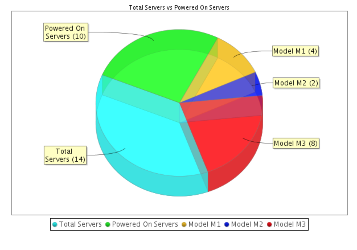
Test #1 (adding different Model to my pie Chart)
var totServers = dcServerList.rowCount();
var powerOffServers = dcServerList.rowCountByColumn("Power State", "off", false);
var modelM1 = dcServerList.rowCountByColumn("Model", "N20-B6620-1", false);
var modelM2 = dcServerList.rowCountByColumn("Model", "N20-B6620-2", false);
var modelM3 = dcServerList.rowCountByColumn("Model", "UCSB-B200-M3", false);
var powerOnServers = totServers - powerOffServers;
var serverSet = ValueSet.create();
serverSet.add("Total Servers", totServers);
serverSet.add("Powered On Servers", powerOnServers);
serverSet.add("Model M1", modelM1);
serverSet.add("Model M2", modelM2);
serverSet.add("Model M3", modelM3);
To make the pie chart larger (Doubled the existing numbers):
htmlFormat.setGraphPrecision(0);
htmlFormat.getGraphPrinter().setBarChartWidth(600);
htmlFormat.getGraphPrinter().setBarChartHeight(400);
htmlFormat.getGraphPrinter().setPieChartWidth(600);
htmlFormat.getGraphPrinter().setPieChartHeight(400);
htmlFormat.printPieChart(serverSet, "Total Servers vs Powered On Servers");
Result:
To create a Bar Graph:
<br>
<h4> Section-3.0: Server Model Inventory</h4>
<p class='indent1'>
<center>
<TABLE class='none'>
<TR><TD class='none' valign='top' width=400>
<Cloupia:ReportScript>
htmlFormat.setGraphPrecision(0);
htmlFormat.getGraphPrinter().setBarChartWidth(1000);
htmlFormat.getGraphPrinter().setBarChartHeight(600);
htmlFormat.printBarChart(serverSet, "", "Number of Servers", "Number Server Models");
</Cloupia:ReportScript>
</TD>
</TR>
</TABLE>
</center>
</p>

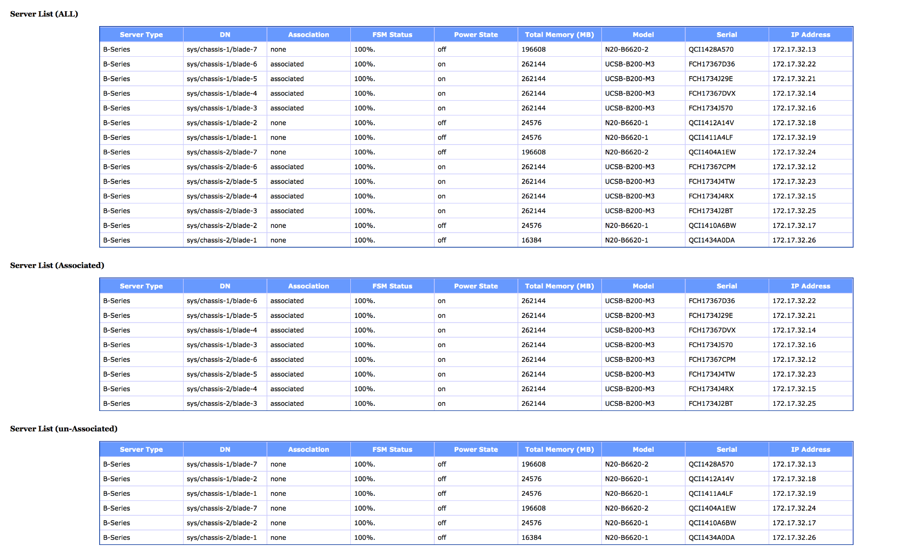
To add a column to a report turn the true to false:
<Cloupia:ReportScript>
dcServerList.columnHide("ID", true);
dcServerList.columnHide("Account Name", true);
dcServerList.columnHide("Name", true);
dcServerList.columnHide("Chassis ID", true);
dcServerList.columnHide("Association", false);
dcServerList.columnHide("Effective Memory (MB)", true);
dcServerList.columnHide("Service Profile", true);
dcServerList.columnHide("Availability", true);
dcServerList.columnHide("Operation State", true);
dcServerList.columnHide("Rack ID", true);
dcServerList.columnHide("Host Node", true);
dcServerList.columnHide("Hypervisor", true);
dcServerList.columnHide("Group", true);
Result is a new column in the report:

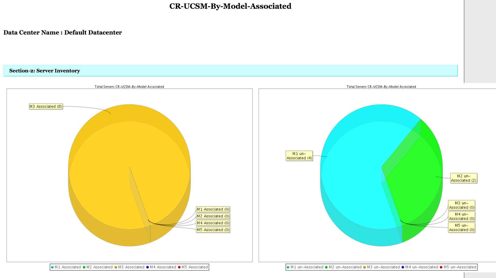
The following Reports are in the zip file. These need to be placed into this directory:
/opt/infra/inframgr/managedreports/
[root@localhost tmp]# tar tvf CR-UCSM.tar
-rw-r--r-- root/root 13562 2015-01-24 11:38:33 CR-UCSM-By-Model-Associated.report
-rw-r--r-- root/root 242 2015-01-24 08:48:31 CR-UCSM-By-Model-Associated.xml
-rw-r--r-- root/root 11362 2015-01-24 08:46:31 CR-UCSM-By-Model.report
-rw-r--r-- root/root 209 2015-01-24 08:17:29 CR-UCSM-By-Model.xml
-rw-r--r-- root/root 11126 2015-01-24 15:18:21 CR-UCSM-Interconnect.report
-rw-r--r-- root/root 221 2015-01-24 14:14:16 CR-UCSM-Interconnect.xml
-rw-r--r-- root/root 11102 2015-01-24 11:46:11 CR-UCSM-T1.report
-rw-r--r-- root/root 191 2015-01-24 11:45:03 CR-UCSM-T1.xml
Installation Example:
scp CR-UCSM.tar root@10.95.4.23:/tmp/.
ssh root@10:95.4.23
cd /opt/infra/inframgr/managedreports/
tar xvf /tmp/CR-UCSM.tar
The result should look like this after browser refresh:

Example Output of Attached Reports:


- Mark as Read
- Mark as New
- Bookmark
- Permalink
- Report Inappropriate Content
Is there a way to make graphs/reports similar to Summary pages shown in flash? These reports are ugly.
- Mark as Read
- Mark as New
- Bookmark
- Permalink
- Report Inappropriate Content
Are talking about the little portlets in the dashboard?
- Mark as Read
- Mark as New
- Bookmark
- Permalink
- Report Inappropriate Content
Yes - the dashboard charts and graphs are much more polished and are of the quality that could be presented to executive management. The exported charts and graphs are not of the same quality.
- Mark as Read
- Mark as New
- Bookmark
- Permalink
- Report Inappropriate Content
I have asked the BU before but I just asked them again of they happen to have and example.
-
Orf Gelbrich
Check out UCS Director Workflow INDEX<https://communities.cisco.com/docs/DOC-56419> on Cisco Communities Site
- Mark as Read
- Mark as New
- Bookmark
- Permalink
- Report Inappropriate Content
Please send me your real e-mail to (ogelbric@cisco.com) thx
-
Orf Gelbrich
Check out UCS Director Workflow INDEX<https://communities.cisco.com/docs/DOC-56419> on Cisco Communities Site
Find answers to your questions by entering keywords or phrases in the Search bar above. New here? Use these resources to familiarize yourself with the community:
