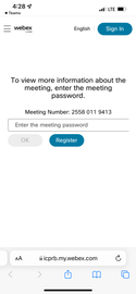
Does anyone know why I get a very different registration page on the desktop vs. a mobile device. When you click "register" in an email on your desktop, you get this beautiful black registration page. When you hit the same link on you email you get a confusing screen that asks for a password so you don't even notice the registration button. I've included a screen show below.
Desktop registration page (with mtg info blacked out):

Mobile registration page:
