Hello to followers of this forum,
I'm an instructor. As part of most sessions I deliver, I try to promote the community pages by giving a little demo of how to find the appropriate forum to follow, starting by visiting the https://community.cisco.com/ landing page.
The first time I did this after the page was updated, I was astounded that the page had regressed from a professional Topic-Oriented forum to a social media site, filled with self-promotion adverts (that I don't think have changed since launch) and Trending Topics, just to re-enforce the social media aspect of the site. (Although, a list of most active discussions is worth having. Call them "Trending" if you have to be "trendy")
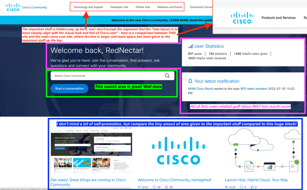
On my first visit, I completely failed to see that the important stuff is hidden way up the top, and I don't accept the argument that the "new layout is to more closely align with the visual look and feel of Cisco.com" - below is a comparison between THIS site and the main cisco.com site, where the font is larger and more space has been given to the important stuff up the top. In fact, at the cisco.com landing page, there's not much else to click on except the sub-section headings.

And of course the illustration also shows just how much space has been allocated to unimportant stuff, like all the user-related guff and the self-promotion acre-for-3-links (as compared to the hole-in-the-wall area given to the sub-forum links)
Conclusion
- Like @TONY SMITH and @Reza Sharifi I'd like to see much of that space better used - the blue area is WAY to big, and if you look at the Cisco.com landing page you'll see that you are almost FORCED to navigate one of the top-menu items, because there is no big blue blob there!
- important sub-forum links more prominent (like cisco.com landing page)
- less space used for user-related statistics and welcome message
- less space used for the self-promotion links following the blue blob
- I also support the idea of a larger editing area as others have mentioned - the concept being that this is a place you come to share ideas, so the two most important things are:
- It has to easy to find stuff, although you probably found it already via Google
- It has to be easy to write good content. I'll have more to say about the editor later (in addition to my last comment)
RedNectar aka Chris Welsh.
Forum Tips: 1. Paste images inline - don't attach. 2. Always mark helpful and correct answers, it helps others find what they need.