- Cisco Community
- Webex
- Webex Community
- Webex Administration
- Re: Video grid layout showing multiple participants at once
- Subscribe to RSS Feed
- Mark Topic as New
- Mark Topic as Read
- Float this Topic for Current User
- Bookmark
- Subscribe
- Mute
- Printer Friendly Page
- Mark as New
- Bookmark
- Subscribe
- Mute
- Subscribe to RSS Feed
- Permalink
- Report Inappropriate Content
04-14-2020 12:25 PM - edited 04-14-2020 12:26 PM
Webex Teams client should allow for showing more than just the currently speaking participant while only showing 2-4 thumbnails of others along the bottom. A feature to allow for a grid layout showing as many people as possible at once (based on window size) should be created. Literally how Zoom does it should be a layout option. Its sometimes referred to as a "brady bunch" style layout. Thank you.
Solved! Go to Solution.
- Mark as New
- Bookmark
- Subscribe
- Mute
- Subscribe to RSS Feed
- Permalink
- Report Inappropriate Content
06-15-2020 10:58 AM - edited 06-15-2020 11:03 AM
Ok this thread took on WAY more things than the original ask, which was for grid layout. I think this can be closed with the recent releases adding this feature. https://help.webex.com/en-us/n4f1ptt/Webex-Teams-Switch-Between-Grid-and-Active-Speaker-Layout-During-a-Meeting
Thank you!
Looking at https://help.webex.com/en-us/8dmbcr/What-s-New-in-Cisco-Webex-Teams
- Windows client got grid view on May 28 2020
- Mac client is getting grid view on June 25 2020
Now I hope it eventually becomes an option on ALL meetings, as it only appears on certain ones but that can be another bug/feature for another day.
- Mark as New
- Bookmark
- Subscribe
- Mute
- Subscribe to RSS Feed
- Permalink
- Report Inappropriate Content
04-15-2020 08:20 PM
This is available in Webex Meetings.
- Mark as New
- Bookmark
- Subscribe
- Mute
- Subscribe to RSS Feed
- Permalink
- Report Inappropriate Content
04-16-2020 10:53 AM
- Mark as New
- Bookmark
- Subscribe
- Mute
- Subscribe to RSS Feed
- Permalink
- Report Inappropriate Content
04-16-2020 11:11 AM
New features and releases can be subscribed to here:
https://help.webex.com/en-us/8dmbcr/What-s-New-in-Cisco-Webex-Teams
- Mark as New
- Bookmark
- Subscribe
- Mute
- Subscribe to RSS Feed
- Permalink
- Report Inappropriate Content
04-16-2020 01:52 PM - edited 04-16-2020 04:12 PM
@SiliconRichard
Thanks, but reading what Cisco thinks that we (users) need is not what I have in mind.
I miss a channel/forum/... where the users tell Cisco how the product has to look like.
not perhaps, not maybe, no excuses and no surprises.
Please: finally start designing your products according the user-needs - or lose marketshare.
It´s that easy.
* I hope the upcoming background-blur also offers Chroma Keying and not just "blurred background".
* What about customizable ring-tones/notification-sounds for different people/teams?
* What about allowing the user (!) to select the color of the teams?
(instead of having them assigned automatically by the software - without any option the change it...)
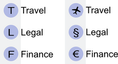
* What about assigning Icons/Emojis to teams?
which is more intuitive?
* What about a (semi-transparent) Video-Overlay (?) to insert your Company-Logo into your Video-Image?
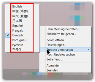
* How about finally an option to change the language of the Client-Software?
(maybe I want to use the english Teams-Interface on a german Windows-System??)
Just have a look how "the other company" handles this:
one click - done.
* How about a more intuitive visual design of Teams?
Examples:
What does this mean? The cat ate the fish?
The seas are polluted?
No ghost in the shell?
This one is about threads...
OK, might be intuitive for an english-speaker, but is NOT for all others.
Even worse: the german explanation-text also uses the word "Thread" but does not translate nor explain it.
Let me give you a (nonsense-) example the other way around:
"My Mütze
Mütze
Here you see a list of all Mütze you are part of in this area.
Here you will find all Mütze you started or answered to."
Do you now know what a Mütze is?
and after all those artwork with a cat (?!?!?!) suddenly a human being - but designed in a different visual style...
cats are out of stock?
...and why does THIS reflect "schedule a meeting" ??
3 people and (ah, here it is again) a cat in a tiny boat during an comet-attack?
I know: you have to "meet" for this boat-trip... but that´s too far-fetched; just show me a calendar and a pen.
There is sooooo much room for improvement.
It´s unsatisfying to wait, until Cisco "by chance" has the right ideas...
kind regards
Fritz
- Mark as New
- Bookmark
- Subscribe
- Mute
- Subscribe to RSS Feed
- Permalink
- Report Inappropriate Content
04-16-2020 04:05 PM
Seriously though, those were all excellent points. Thanks for putting it out there.
- Mark as New
- Bookmark
- Subscribe
- Mute
- Subscribe to RSS Feed
- Permalink
- Report Inappropriate Content
06-15-2020 10:58 AM - edited 06-15-2020 11:03 AM
Ok this thread took on WAY more things than the original ask, which was for grid layout. I think this can be closed with the recent releases adding this feature. https://help.webex.com/en-us/n4f1ptt/Webex-Teams-Switch-Between-Grid-and-Active-Speaker-Layout-During-a-Meeting
Thank you!
Looking at https://help.webex.com/en-us/8dmbcr/What-s-New-in-Cisco-Webex-Teams
- Windows client got grid view on May 28 2020
- Mac client is getting grid view on June 25 2020
Now I hope it eventually becomes an option on ALL meetings, as it only appears on certain ones but that can be another bug/feature for another day.
- Mark as New
- Bookmark
- Subscribe
- Mute
- Subscribe to RSS Feed
- Permalink
- Report Inappropriate Content
04-16-2020 02:36 PM
Thanks for sharing this feedback, Fritz. We're going to pass it along to the Cisco Webex team. Please also feel free to reach out to our customer experience team at cxlab@cisco.com if you have any additional thoughts.
- Mark as New
- Bookmark
- Subscribe
- Mute
- Subscribe to RSS Feed
- Permalink
- Report Inappropriate Content
04-16-2020 03:52 PM
@SiliconRichard
Thanks for your support!
- Mark as New
- Bookmark
- Subscribe
- Mute
- Subscribe to RSS Feed
- Permalink
- Report Inappropriate Content
04-16-2020 10:35 AM
@SiliconRichard
Why?
It´s hard for me to understand why Cisco treats Meetings and Teams like very different products.
from the User´s point of view they are not: User A can see, hear and talk to User B, C, D ...
I think: every Webex-<whatever> - Collaboration-tool should use the same "engine"
and the same user-interface for the same basic tasks.
Everything else is just confusing.
Confused Customers use other, less confusing products....
Discover and save your favorite ideas. Come back to expert answers, step-by-step guides, recent topics, and more.
New here? Get started with these tips. How to use Community New member guide


