- Cisco Community
- Community Corner
- Community Feedback
- Community Feedback Forum
- Re: Welcome to Cisco Community, reimagined!
- Subscribe to RSS Feed
- Mark Topic as New
- Mark Topic as Read
- Float this Topic for Current User
- Bookmark
- Subscribe
- Mute
- Printer Friendly Page
- Mark as New
- Bookmark
- Subscribe
- Mute
- Subscribe to RSS Feed
- Permalink
- Report Inappropriate Content
07-10-2022 08:54 AM - edited 07-11-2022 12:27 PM
Our read-only phase is complete and we are happy to welcome you back to Cisco Community! You can read more about this project here, with a forthcoming FAQ as well.
Things may look different but the core concept is still the same: this is your space to meet and engage with peers, ask questions, share projects and provide feedback.
While we have spent the last 96 hours implementing, QAT-ing and tweaking layouts and formats to make things ready for you, there's a probability that something may have been missed, or you find a new and creative way to do something we hadn't thought to do.
As you come across these kinds of reports, or if you have suggestions for future enhancements, we invite you to leave a comment with details in the thread below. If you'll also include the following that will help us address it with our Developers quickly:
- URL of the board, post, group or space you encountered an issue with
- Screenshot if applicable
While we can't guarantee that your specific suggestion will be implemented, it will help us guide the future of Cisco Community.
Solved! Go to Solution.
- Labels:
-
Community Feedback Forum
- Mark as New
- Bookmark
- Subscribe
- Mute
- Subscribe to RSS Feed
- Permalink
- Report Inappropriate Content
07-27-2022 07:43 AM
Hi @John Steele - I see what you mean.Other than the titles 'underlining' when you hover over them, there isn't really any other visual cue. We're working on making a bigger distinction for read vs unread threads, but don't have anything on the books for changing the color. I'll get this added to the list of possible future enhancements!
- Mark as New
- Bookmark
- Subscribe
- Mute
- Subscribe to RSS Feed
- Permalink
- Report Inappropriate Content
08-05-2022 07:33 AM
@John Steele wrote:
This might have been suggested already but the title of the forum post should be a different color to signify that it is clickable. I find myself moving my mouse around for a little trying to click when looking at the snapshot of multiple posts because the letters are black like the written content and other things on the page.
Hi @John Steele - there was a release this week and a visual distinction was made to address this. Conversation titles should now appear in blue to distinguish them. Unread conversations display titles in bold, and un-bold once they've been read. Hoping this makes things a bit clearer!
- Mark as New
- Bookmark
- Subscribe
- Mute
- Subscribe to RSS Feed
- Permalink
- Report Inappropriate Content
07-29-2022 06:19 AM
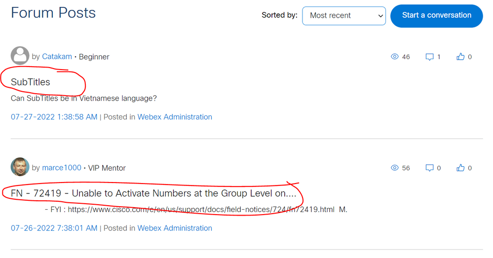
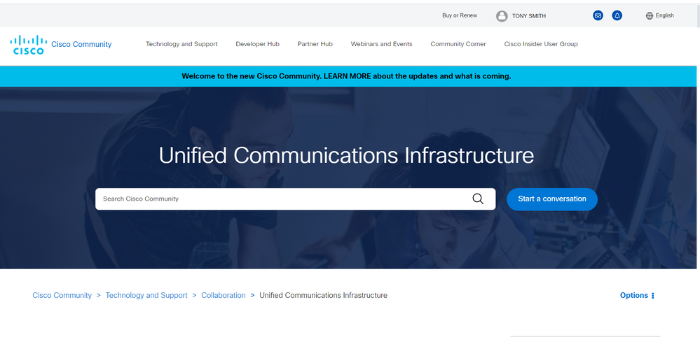
What I don't like about the new format is how much space is taken up, I would say "wasted". For example on my laptop screen, which is 1920x1080, the initial display of a particular forum does not show ANY content. The entire screen is occupied by headers with loads of empty space ...
- Mark as New
- Bookmark
- Subscribe
- Mute
- Subscribe to RSS Feed
- Permalink
- Report Inappropriate Content
07-29-2022 10:58 AM
@TONY SMITH wrote:
What I don't like about the new format is how much space is taken up, I would say "wasted". For example on my laptop screen, which is 1920x1080, the initial display of a particular forum does not show ANY content. The entire screen is occupied by headers with loads of empty space ...
--Edit to remove screenshot--
Hi @TONY SMITH - the intent of the new layout is to more closely align with the visual look and feel of Cisco.com, including the use of white space and more prominent headers.
Thank you for sharing that it's trickier to navigate now, though - I'll make sure that feedback is shared!
- Mark as New
- Bookmark
- Subscribe
- Mute
- Subscribe to RSS Feed
- Permalink
- Report Inappropriate Content
07-29-2022 01:27 PM
- Mark as New
- Bookmark
- Subscribe
- Mute
- Subscribe to RSS Feed
- Permalink
- Report Inappropriate Content
08-01-2022 01:52 AM - edited 08-01-2022 01:52 AM
I agree with the others on this.
This seems to happen every time the forums are updated ie. far too much space wasted on the layout which I suspect is because the people who design the layout etc. are not the ones answering questions.
When you are answering questions you want to see as many of them in your view as possible whereas currently you don't even see a single question and even when you scroll down far too much space per question is used.
Jon
- Mark as New
- Bookmark
- Subscribe
- Mute
- Subscribe to RSS Feed
- Permalink
- Report Inappropriate Content
03-21-2023 06:23 AM
- Mark as New
- Bookmark
- Subscribe
- Mute
- Subscribe to RSS Feed
- Permalink
- Report Inappropriate Content
07-30-2022 06:49 AM
@Tyler Langston wrote:
Hi @TONY SMITH - the intent of the new layout is to more closely align with the visual look and feel of Cisco.com, including the use of white space and more prominent headers.
That provides some explanation, but not really an excuse. Unless both are designed to be used only by people with 4K (or bigger) displays, then both Cisco's current web site and the new Community are really badly designed. Why would anyone think it a good thing to waste so much space, and hide useful content way down off the screen? Why is it a good thing for white space and oversized headers to take priority over actual content?
- Mark as New
- Bookmark
- Subscribe
- Mute
- Subscribe to RSS Feed
- Permalink
- Report Inappropriate Content
07-30-2022 12:59 PM
I'm with you @TONY SMITH. The assumption that everyone is using a tablet or phone to consume this content shouldn't be an excuse to NOT adjust for larger screens.
Forum Tips: 1. Paste images inline - don't attach. 2. Always mark helpful and correct answers, it helps others find what they need.
- Mark as New
- Bookmark
- Subscribe
- Mute
- Subscribe to RSS Feed
- Permalink
- Report Inappropriate Content
08-23-2022 10:48 AM - edited 08-23-2022 10:48 AM
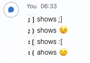
I just noticed that Smileys do not work anymore. I often use <semicolon><closing bracket> and it was replaced by a small winking smiley. That does not work anymore (imagine <colon><opening bracket> for a sad smiley)
- Mark as New
- Bookmark
- Subscribe
- Mute
- Subscribe to RSS Feed
- Permalink
- Report Inappropriate Content
08-23-2022 01:36 PM
Hi @dtibbe ,
Is this what you mean?
AND WOW HALLELUJAH - I just pasted that image DIRECTLY into this reply - that's NEVER worked before today
Forum Tips: 1. Paste images inline - don't attach. 2. Always mark helpful and correct answers, it helps others find what they need.
- Mark as New
- Bookmark
- Subscribe
- Mute
- Subscribe to RSS Feed
- Permalink
- Report Inappropriate Content
08-23-2022 10:55 PM
Yep, that's what I've been referring to
- Mark as New
- Bookmark
- Subscribe
- Mute
- Subscribe to RSS Feed
- Permalink
- Report Inappropriate Content
09-13-2022 06:21 AM
Awesome theme !
- Mark as New
- Bookmark
- Subscribe
- Mute
- Subscribe to RSS Feed
- Permalink
- Report Inappropriate Content
11-23-2022 01:34 AM
I understand how to get this problem resolved please suggest
- « Previous
- Next »
Discover and save your favorite ideas. Come back to expert answers, step-by-step guides, recent topics, and more.
New here? Get started with these tips. How to use Community New member guide


